
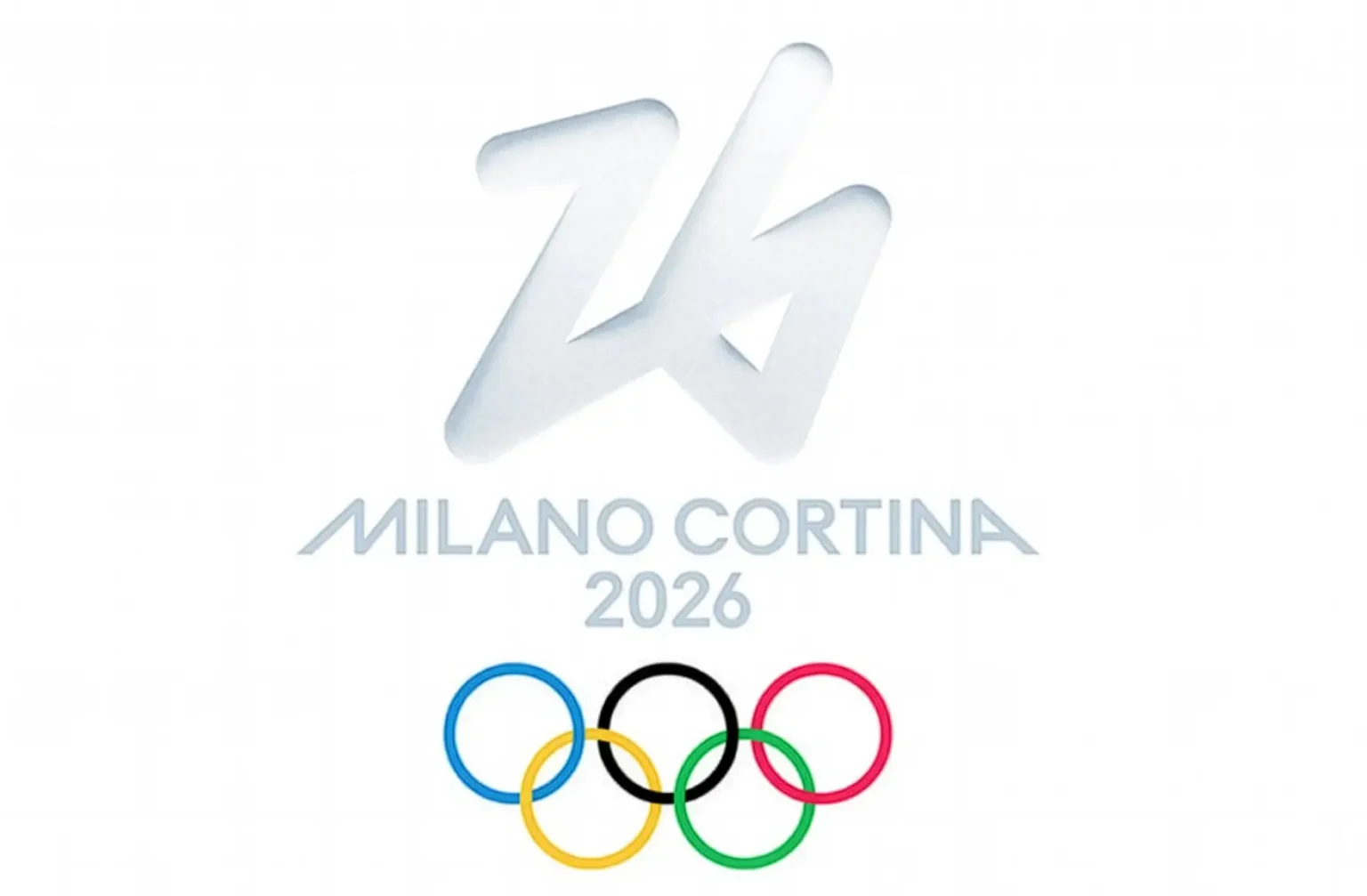
The 2026 Winter Olympics have just wrapped in Italy, and whilst the Games themselves delivered spectacular moments against the stunning backdrop of the Dolomites, the official logo prompts questions about creative ambition in major event branding.
The “Futura” emblem is a single-stroke trace of the number “26” rendered in ice white. The organisers positioned it as representing “small gestures having grand impacts,” drawing on the metaphor of a finger traced through misty glass. It’s minimalist, accessible, and deliberately understated.
For a Games celebrating Italian design heritage, hosted in Milan (one of the world’s design capitals) and set against the dramatic Alpine landscape of Cortina d’Ampezzo, the question becomes: was understatement the right choice?
Henri Matisse famously observed that “creativity takes courage.” At Oracle Creative, we return to this quote often. The Milano Cortina 2026 logo suggests that perhaps courage may not have been the priority.
The Democratic Design Dilemma
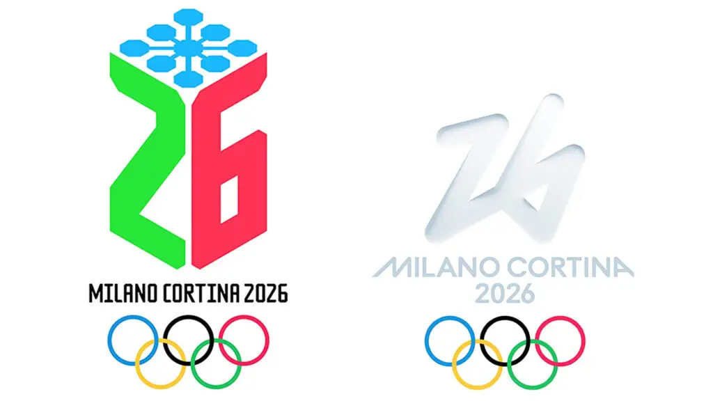
Milano Cortina 2026 made history as the first Olympics to let the public vote on the logo. Design agency Landor developed approximately 30 initial concepts. From these, the committee narrowed the field to just two options: Logo Futura and Logo Dado.
Logo Dado featured a gaming joystick shape designed as a snowflake, with the numbers 2 and 6 in green and red creating a three-dimensional effect. Futura won decisively with 75% of 871,000 votes from 169 countries.
Incidentally, when looking at just these two options, we at Oracle Creative agree with the public’s choice. Futura is undoubtedly the more refined of the pair. But this raises an uncomfortable question: was this a strategic pairing designed to guarantee a particular outcome whilst maintaining the appearance of democratic choice? When the choice is between “safe and refined” versus “potentially controversial,” the public will pick refined every time. That doesn’t mean refined was the right answer to the original brief.
The public had no access to the other 28 concepts Landor developed, and no opportunity to champion genuinely adventurous possibilities.
Off-Piste Alternatives
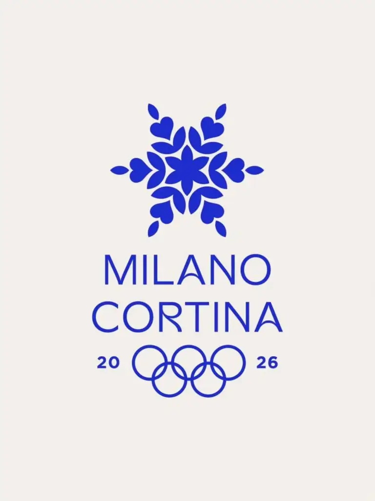
What’s particularly revealing is seeing what the same brief inspired outside the official process. Minneapolis-based designer Allan Peters created an alternative that incorporated snowflake geometry whilst drawing on Italian design heritage: unmistakably Italian, unmistakably winter, and unmistakably bold. After gaining traction some momentum, the posts were removed, raising questions about whether the organising committee took issue with alternative visions.
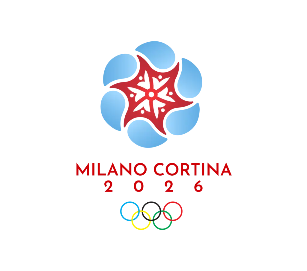
Designer Emily Hudson’s concept on Behance drew direct inspiration from the intricate rose window of the Duomo di Milano whilst incorporating snowflake geometry and Cortina’s alpine colours.
These alternatives asked a different question: rather than whispering about small gestures, could the logo have shouted about Italian creativity, Alpine drama, and the spectacle of elite sport?
The London 2012 Lesson
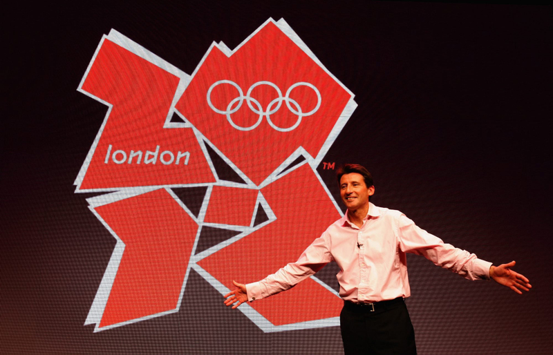
The comparison with London 2012 is instructive. Wolff Olins’ jagged logo was met with fury when it launched in 2007. Over 48,000 people signed a petition demanding it be scrapped. Iran lodged a formal complaint claiming it spelled “Zion.” Critics called it everything from “fundamentally patronising” to various unfortunate resemblances we won’t repeat here.
But here’s what’s fascinating: people remember it. Love it or loathe it, the London 2012 identity sparked genuine debate about design and what an Olympic logo should represent. It was divisive, bold, and unapologetically different.
Fifteen years later, that controversy has aged into vindication. According to recent surveys, 81% of people believe it was right to invest in the Olympics whilst 79% are proud of its legacy. As Wolff Olins’ CEO Sairah Ashman reflected: “We’re not proud of the controversy, but in retrospect, it’s great that it got so much attention in a way that these things never normally do.”
Milano Cortina 2026 chose the opposite path. Where London provoked, Milano soothed. Where London took risks, Milano offered reassurance.
What We Remember
TThe most enduring Olympic identities take clear creative positions. Mexico 1968’s psychedelic Op Art patterns referenced Mexican folk art whilst feeling utterly of its moment. Munich 1972’s Bauhaus geometry spoke to German design rigour. Calgary 1988’s snowflake-maple leaf was simple but clever. Even London 2012’s angular chaos, initially derided, is now remembered.
These identities worked not because they pleased everyone immediately, but because they took a position. They challenged. They surprised.
Milano Cortina 2026’s Futura is a gesture rather than a statement, a whisper rather than a declaration. For some, that restraint may feel appropriate. For others, it represents a missed opportunity for a Games celebrating Italian creativity in one of the world’s design capitals.
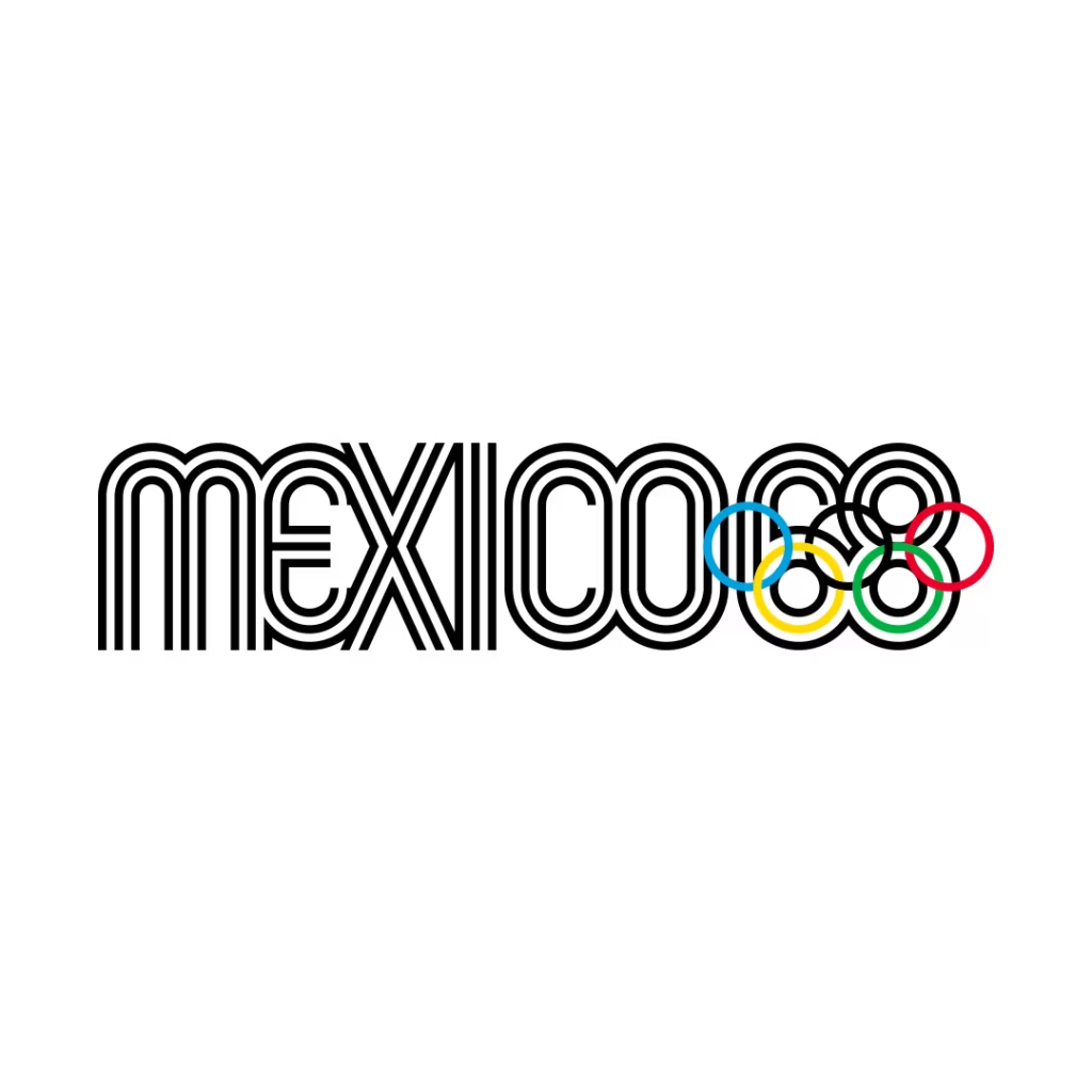
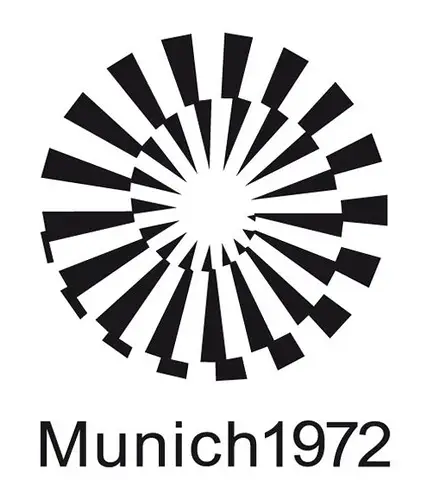
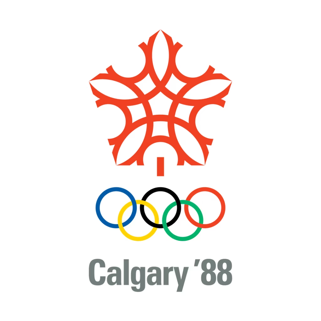
Above: Some classic examples with groundbreaking appeal.
The Bigger Question
The irony is the Olympics celebrate the pursuit of excellence, the willingness to push boundaries, the courage to attempt what seems impossible. These are athletes who’ve dedicated their lives to being exceptional rather than acceptable. The opportunity is there just waiting to celebrate culture and sport in the grandest of occasions, in front of the watching world.
We’ll never know what might have been if the organising committee had looked at Allan Peters’ snowflake concept, Emily Hudson’s cathedral-inspired fusion, or any of the other 28 concepts that Landor developed but deemed too risky to put before the public.
The question Milano Cortina 2026 leaves us with isn’t whether Futura is a “bad” logo. It’s whether events of this magnitude deserve creative work that’s as ambitious as the athletes competing in them, or whether avoiding controversy has become the safest choice of all.
Sometimes the most revealing thing about a design process isn’t the result, but the limits placed on what was possible from the start.
Need help with a brand? Ask Oracle Creative

