
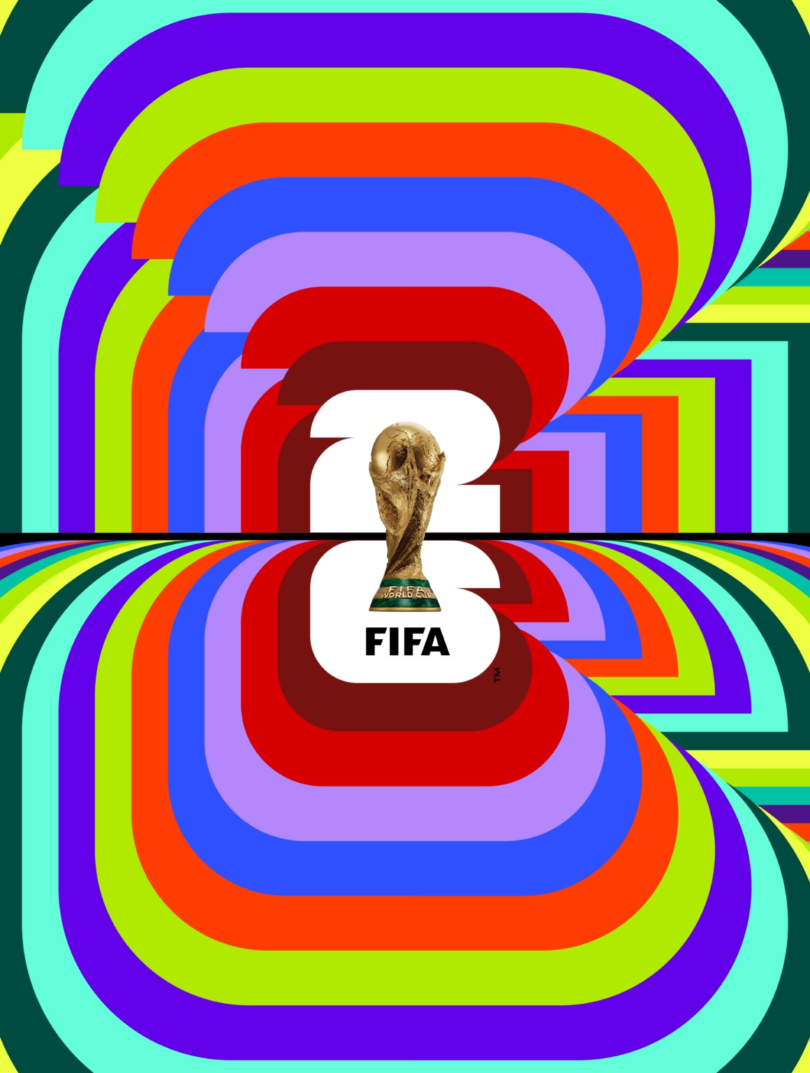
Here is a question worth asking on the eve of the last 16. Who do you trust with the most watched brand on the planet? FIFA had every global agency network on speed dial. Instead, piece by piece, the 2026 identity went to a small studio in Toronto, an indie type foundry in Montreal and, for the scarves, a single designer in Leeds. Three weeks of football later, that decision is looking very good indeed.
How an independent studio built the mark
The emblem, unveiled in May 2023 by Gianni Infantino and Ronaldo, was developed by Public Address, an independent Toronto studio that had already shaped the 2023 Women’s World Cup identity. A small team, not a network giant. A studio you could fit around one long dinner table.
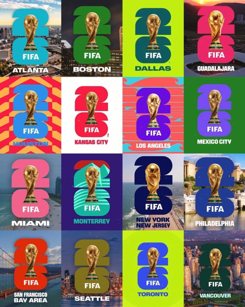
What they made looks disarmingly simple: the real trophy, shown for the first time in World Cup history, sat inside a stacked 26. The internet’s launch day verdict was that a child could have drawn it. But the 26 is built from 48 squares and quarter circles, one for each competing nation, curves for the ball, straight edges for the pitch. And the mark is black and white on purpose, because it is designed to be filled. Each of the 16 host cities pours its own colour and pattern into the same shape, so the brand changes character from Mexico City to Vancouver without ever stopping being itself. FIFA has confirmed this trophy-and-year structure is now the permanent template for future tournaments, much as the Super Bowl standardised its logo. A small team designed something built to outlive them.
An indie foundry drew the letters
The typeface, FWC 2026, is the part with the personality: ultra condensed, heavy, geometric, built to be read from the back of a stand. FIFA has never formally credited the designer, but most of the design world points to Pangram Pangram, a Montreal foundry loved by young independent designers, famous for giving good fonts away and charging fairly for the rest. Not the legacy type house you would expect on the biggest job in sport. If that credit holds, the world’s most visible lettering came from a small, sharp studio, and that gets a standing ovation from our end of the terrace.
It is not flawless. The tournament found its weak spot on the tiny broadcast scoreboard, where those heavy condensed country codes are hard work at small sizes. A face this bold needed a lighter cut for the small stuff. But that is a note for version two, not a reason to have played it safe.
[IMAGE 3: The FWC 2026 typeface in use on tournament graphics. Source: Creative Bloq, https://www.creativebloq.com/design/fonts-typography/did-fifa-miss-the-net-with-the-2026-world-cup-font or Pimp My Type, https://pimpmytype.com/fifa-2026-font/ (email Oliver Schöndorfer for permission, he is likely to share the post in return). Caption credit: FWC 2026 typeface, FIFA]
And one designer drew every scarf
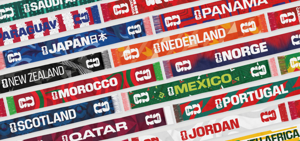
Our favourite proof is not on a screen at all. Global Scarves, the third generation textile firm holding the official licence for scarves and bucket hats, gave the design job to Hand Drawn Pixels, a small independent design studio in Leeds. What started as a handful of host nation scarves grew into close to 200 designs, and every single one was drawn by one person: Tom Pitts, the studio’s founder, from first sketch to finished product.
These are not flag-and-football clichés. He researched each country properly, pulling from architecture, folklore, historic kits and local typography, giving 48 nations identities rooted in somewhere real. You have watched thousands of them turn stands into walls of colour these past few weeks. One person did that.
Small is not a compromise
There is a lazy assumption in our industry that big briefs need big agencies, as if quality scales with headcount. This World Cup quietly dismantles it. The strongest identity work of the tournament came from teams small enough that the people who won the pitch actually did the work. No layers, no hand-offs, no dilution between the idea and the delivery. That is the real advantage of small: the thinking and the craft live in the same hands.
We would say that, of course. We are a small independent design studio ourselves, and after five decades we have stayed that way deliberately. But you do not have to take our word for it any more. Just look at the badge on the shirt, the letters on the stadium, and the scarf round the fan’s neck. The biggest show on earth is wearing the work of small teams, and it fits beautifully.
The real test is still to come. FIFA has said this trophy and year design language anchors the World Cup emblem for 2026 and beyond, and the next edition will stretch it further than anyone imagined: Spain, Portugal and Morocco co-hosting in 2030, with centenary matches in Uruguay, Argentina and Paraguay to mark 100 years since the first tournament. Six nations, three continents, one number to fill. If the frame holds, and we suspect it will, the quiet discipline of a small Toronto studio will be carrying the World Cup for decades.
Need help with a brand? Ask Oracle Creative

