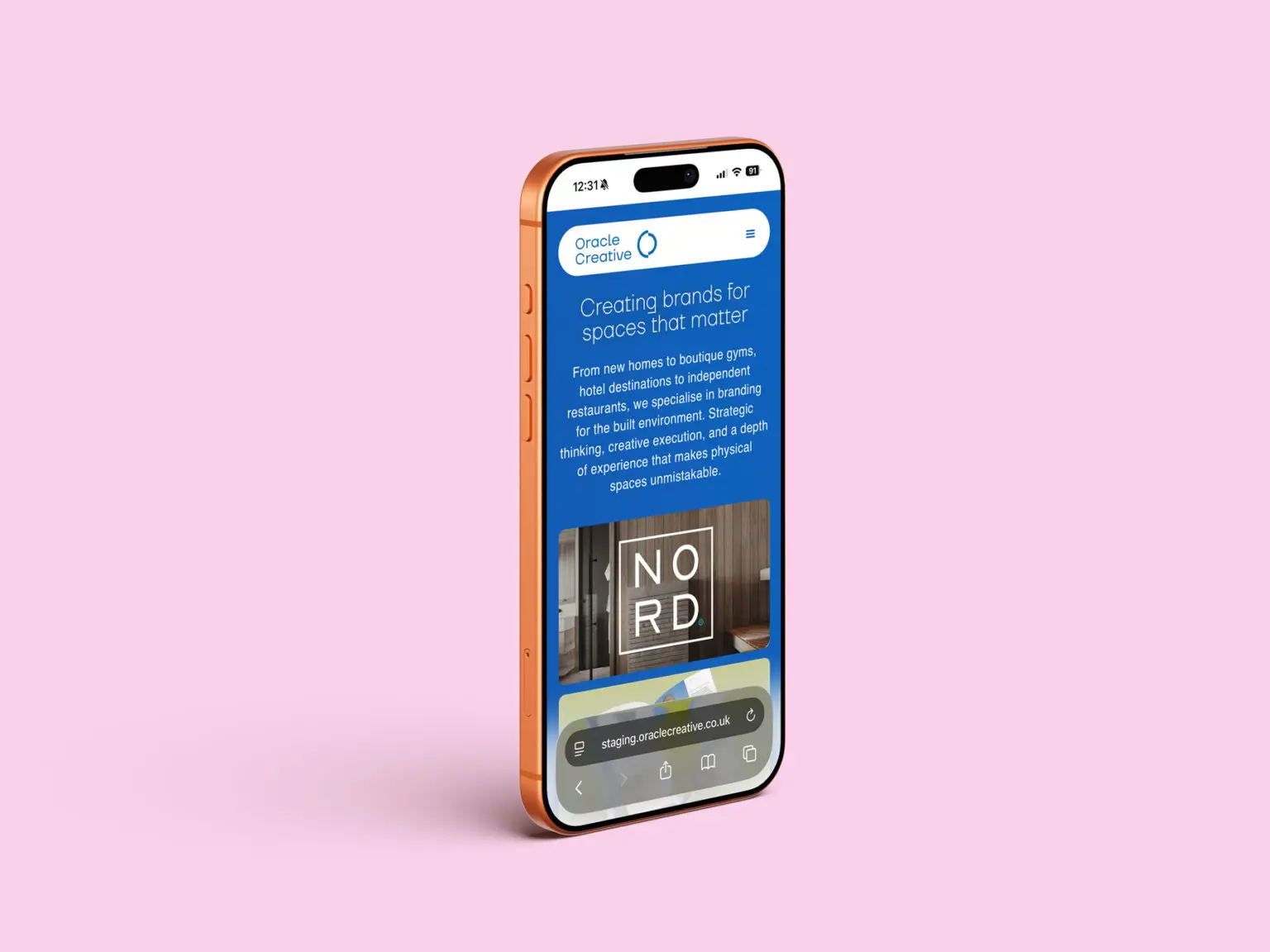
There’s a running joke in the industry: agencies are terrible at building their own websites. Some outsource it entirely. Others let their site languish for years whilst they pour everything into client work… we were guilty ourselves. It’s not laziness, it’s psychology. When it’s your own brand, every decision feels loaded. Every word gets rewritten five times. Every layout gets over analysed.
We decided to stop overthinking it and just build the site we’d recommend to a client. Mobile first, Fast, Clear and Optimised for conversion. Built on WordPress because that’s what works.
A Brand Evolution, Not a Revolution
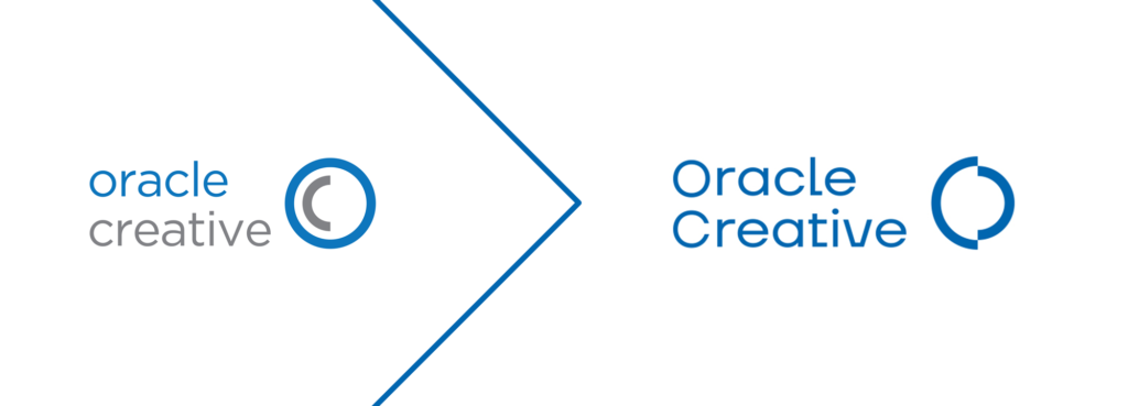
We rebranded last year. New typeface, refreshed colour palette, sharper positioning. But this wasn’t about reinvention. We’re still recognisably Oracle Creative.
The logo evolved rather than a complete transformation. It’s more energetic now, built for animation, but it keeps the rounded, approachable feel that’s always defined us. The O is split, creating a sharp edge that hints at precision and cutting-edge thinking. Those two parts also form an O and a C coming together, which captures what we actually do: Oracle, the insight and strategic thinking, meeting Creative, the ideas and execution. An oracle, in the original sense, was a source of wisdom and guidance. We like that, as did our founders in 1970. It’s about experience informing decisions, not guesswork dressed up as strategy.
The colour palette shifted from muted blue and grey to something bolder. Stronger blue, darker grey, and a new pale pink as an accent. Every brand needs a highlight colour for hover states, call-to-action buttons, and moments that need emphasis. Pink does that job with subtelty.
We made a deliberate choice to use an all-over blue background. Research into other design agency websites showed a lot of white space and minimal layouts. We wanted something different. Retro in spirit, contemporary in execution, memorable. The rounded lozenges for the menu bar and footer reference mid-century design whilst feeling unmistakably modern. There’s a bit of Apple in the rounded buttons and navigation, because that level of polish just works and fits in nicely with the operating system a lot of us designer types use.
Every image has rounded corners. Every icon is circular. It softens the overall look and creates visual consistency across the site. We only use a hamburger menu on mobile. Desktop users get a full, always-visible navigation, which is always sticky, so users can always just to the next page.
WordPress: Why We Choose It Every Time
We build every website on WordPress. Not because approximately 44% of websites currently online are built on WordPress, but because it’s the smartest and most economical choice for most businesses.
WordPress gives us complete creative control whilst keeping the backend simple enough that clients can update content themselves. The myth that WordPress is slow or insecure comes from poorly built sites with too many plugins doing jobs they shouldn’t. We build it properly so you get speed, security, and control.
Making Search Engines Work
SEO isn’t magic. It’s structure, speed, and clarity. We optimised every page for fast loading, clean markup, and mobile responsiveness. Proper alt text on images. Logical heading structure. Meta descriptions that actually describe the content.
But the real shift is happening with AI-powered search. Google isn’t just crawling keywords anymore, it’s understanding context and intent. That means content needs to be genuinely useful, not just optimised for algorithms. We wrote every page to answer the questions potential clients actually ask. What do you do? Who have you worked with? How do you approach projects?
Portfolio: Making the Work Easy to Find
We organised everything by service area with clear case studies that explain the brief, the thinking, and the outcome. No mystery thumbnails. No hunting through endless grids.
Each project lives on its own page with proper context, so whether you’re interested in branding, brochures, web design, advertising or outdoor campaigns, you can find relevant examples without scrolling through everything we’ve ever made.
Designing for Conversion, Not Just Aesthetics
A beautiful site that doesn’t convert is a failed site. Every layout decision on the new Oracle Creative site was driven by user experience and conversion optimisation.
Mobile first
Designing for smaller screens forces you to prioritise. What’s actually essential? What needs to be front and centre? That discipline carries through to desktop and makes everything sharper.
Clear navigation
People don’t want to hunt for information. Services, portfolio, contact. Everything is where you’d expect it to be.
Fast load times and accessibility
Nobody waits for slow sites anymore. Optimised images, minimal scripts, clean code. The site loads in under two seconds in a Pingdom speed test, rated B with 83%. We’re working on a grade A. We’ve also built accessibility into the foundations using Elementor’s Ally plugin, ensuring the site works properly for people using screen readers, keyboard navigation, and assistive technologies. Accessible design isn’t a nice-to-have anymore, it’s essential, and it makes the experience better for everyone.
Ready to rebuild your website?
We’ve been through the process hundreds of times, so we know exactly what works and what doesn’t. If your site is slow, difficult to navigate, or just not converting the way it should, let’s talk about how we can fix it.
Get in touch to discuss your website project, or explore our web and digital work to see what we’ve built for clients across property, hospitality, and retail.